Cutting school onboarding from two weeks to two days.
Pijar helps schools run digital exams, attendance, and admin. The catch: getting a new school set up took up to two weeks, and someone from our team had to walk them through every step. I led the redesign of that first-run experience so admins could do it themselves — in an afternoon, not a fortnight.
Two weeks just to say hello
Picture a school that just signed up, buzzing to go digital — then it hits setup, and stops dead.
Once the account was created, admins were on their own — and stuck. Every school ended up asking our ops team to key in their data by hand, which stretched activation to about two weeks each. The frustrating part? Schools already keep all of this in DAPODIK, the national education data standard. We were basically asking them to copy what they’d already filled out — into a form that named everything differently. Like being handed a menu in a language you don’t read, then ordering and hoping for the best.
So I went and watched
Before I opened Figma, I sat with the people actually living this — school admins, and the ops crew rescuing them. The same three things came up every time.
The part nobody said out loud
Strip it back, and three things were quietly going wrong.
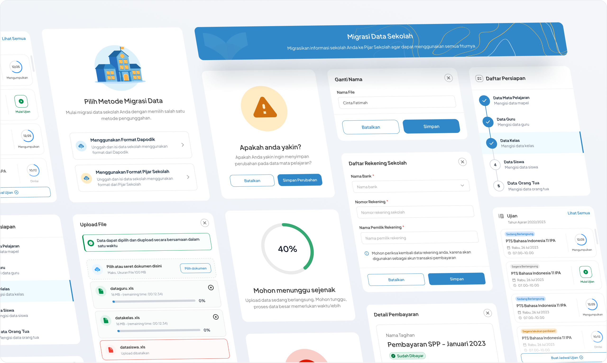
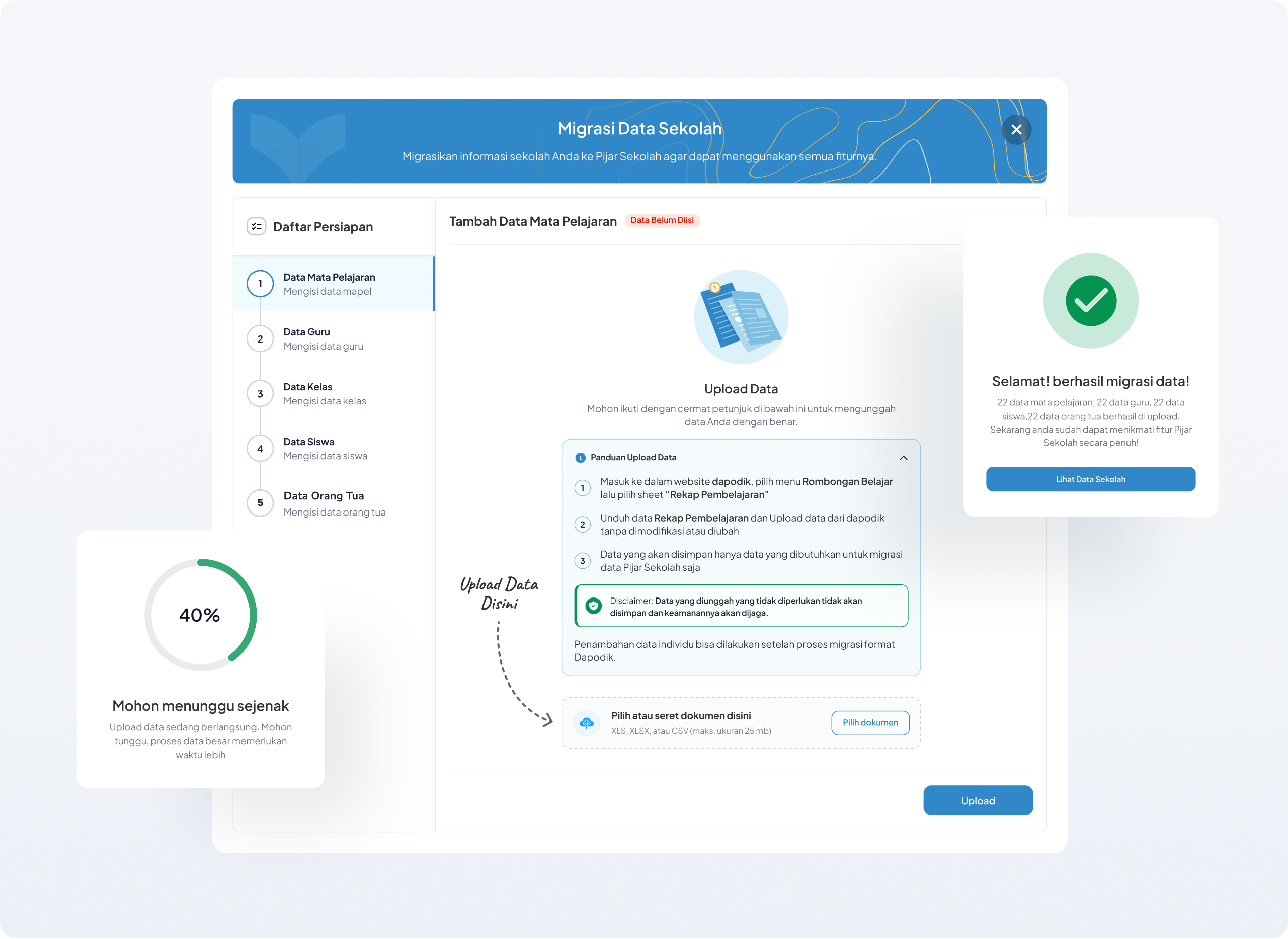
Stop asking schools to type. Let them hand over the file they already have — and do the translating for them.
Four moves
What I tried
The old flow never told you anything was expected of you. No prompt, no progress, no finish line. So setup felt optional — people poked around, then left it half-done.
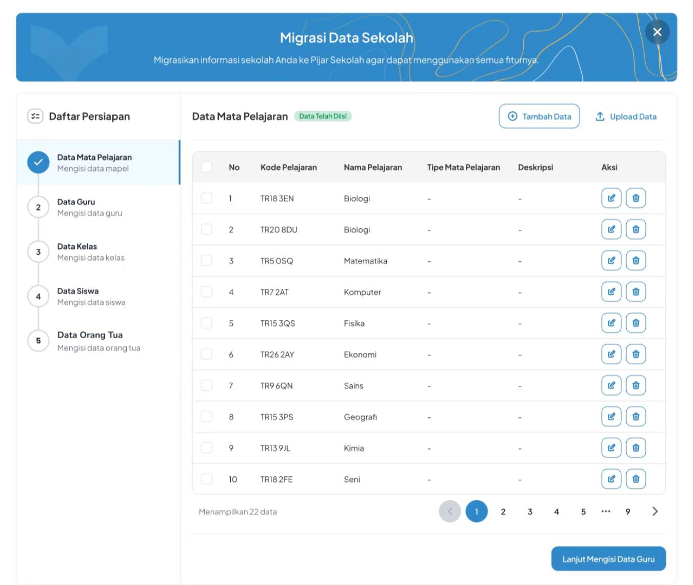
I sketched two ways to walk people through it: a step bar across the top, or one down the side. I went with the side — it keeps you on one task at a time, but the finish line never leaves your sight, which matters when the person filling this in isn’t especially technical. Uploads happen one type at a time (kinder to the backend), and you can always save a draft and come back.
Where it tripped up
We tested with ops folks and real admins. A few small things were quietly tripping people up.
Pressure-tested with engineering
A design only counts once it ships. So from the very first ideation I pulled in developers, data scientists, and the ops team — partly to catch technical limits early, before they turned into rework.
That collaboration changed real decisions:
Sequential upload. Engineering flagged that pushing every record at once could overload the system, so we restricted it to one data type at a time — students, then teachers. It happened to help users too: smaller batches are easier to check.
Save as draft. Letting admins save and continue later eased the pressure on them — and doubled as a backend optimization the devs wanted anyway.
Guidance at every step. The ops team, who’d been doing this migration by hand, pushed for clear instructions on each step so admins could finish it on their own.
Then we rolled out to a small set of schools first, to confirm it held up before going wide. Feasibility and a safe rollout shaped the design as much as the flow itself.
The calls I made
I broke the upload into smaller batches. Dumping every record in at once meant nobody actually checked them. Splitting it into chunks gave people room to preview each batch and catch mistakes as they went — I wanted accuracy, not just speed.
I let testing settle the stepper debate. Horizontal or vertical? Rather than argue it in a meeting, I ran both past real admins. The vertical side stepper won — one step in focus, the rest waiting quietly — because it kept people from feeling overwhelmed.
“Start with the data, not the screens. Seeing what people actually keep made the priorities obvious.”
What I’d take forward“Pull the rest of the team in early. Engineering and ops caught things I’d have missed on my own.”
What I’d take forward